magazine analysis - DIY
- cari

- Nov 16, 2018
- 3 min read
Updated: Apr 21, 2019
ABOUT DIY:
DIY Magazine is a UK-based music publication (both in digital and physical form). It is published by Sonic Media Group.
I will analyse Issue #73 (from April 2018)
THE COVER:
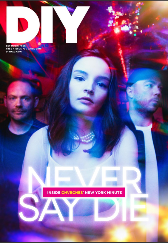
The cover has a masthead - 'DIY' written in white, big & bold letters at the top of the page. 'SET MUSIC FREE' is written right under the title, in very tiny letters compared to the huge masthead. The number of the issue, as well as the date and DIY's website are written right under as well. There is also contains a cover line: 'INSIDE CHVRCHES' NEW YORK MINUTE', written in a pink rectangle in the bottom half of the cover. There isn't a price or barcode written on the cover. The image on the cover is of the band CHVRCHES; it has red and blue hues. 'NEVER SAY DIE' is written in white capital letters over the image, right under the cover line.
THE TABLE OF CONTENTS:
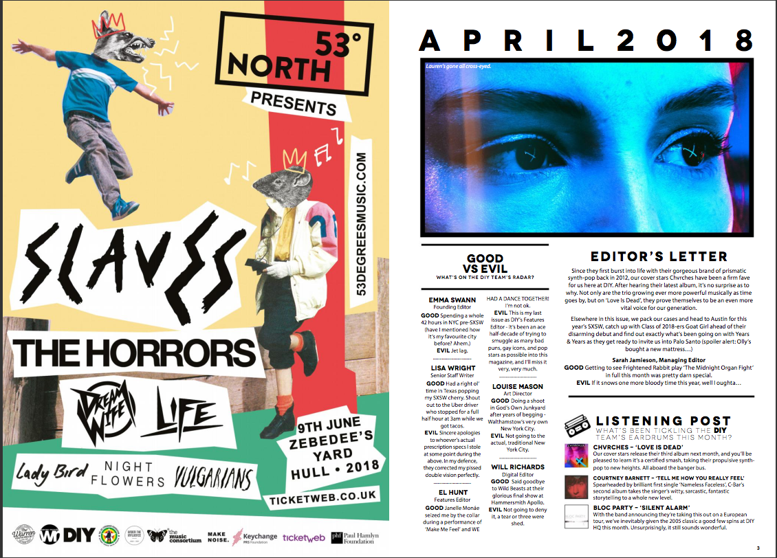
The pages following the cover contain as follows: a collage page with differnet types of bands (THE HORRORS), websites (ticketweb.co.uk), dates & locations of an event (9th June, Zebedee's Yard Hull) and movies (Lady Bird). At the bottom side of the page, there is a white banner with some companies & organizations (presumably the sponsors). The next page contains and Editor' Letter, a section called 'GOOD VS EVIL' (where the DIY team talk about what good and bad things happened to them recently), and a 'LISTENING PODCAST' section, where there are recommended 3 songs. One song is from the band CHVRCHES - the band on the cover.
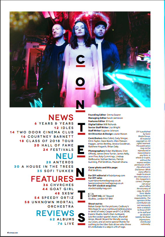
The 4th page is a CONTENTS page. There is a photo of CHVRCHES on the upper third of the page. 'CONTENTS' is written horizontally with bold capital letters, splitting the text into two columns: on the left side, there's written the page number and what the article on the page is about (be it bands, festivals, or hall of fame) - the pages go up until 74 and the contents are split in 4 categories (NEWS, NEW, FEATURES and REVIEWS). On the right side, there is a list of people who worked on the magazine (editors, writers, art direction & design, contributors and photographers); there's also the contact information of DIY, and there is also a 'shout out to' section right under. On the leftmost side of the contents pge, there is a short brief about how DIY may not be reproduced or transmitted (copyright) and there is also a disclaimer which states that the publishing house is not responsible for inaccuracy of information, if any, in the magazine.
THE MAGAZINE ARTICLES:
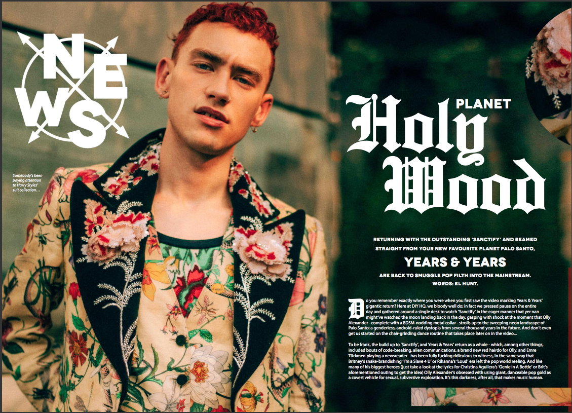
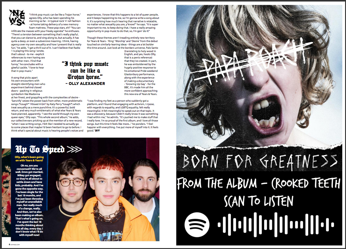
The Years and Years double spread contains a picture of the singer, a logo saying 'NEWS' in a stylized manner, and a comment about his clothes written in very small letters. On the right page, the title of the article is written in big letters, taking up almost a fourth of the page. It is written in an Old English style. Right below it, there is a headline which is significantly smaller, although it is written in capital letters. It talks about Years and Years' new song 'Sanctify', highlighting the band's name by making it almost double the size of the headline text. As for the text, only the first letter is written in a different style - much like old storybooks start. It is written in a very informal and comedic manner, making the reader feel as if they're reading a letter or a (very) long message from a friend. The text talks about the people from DIY who have waited for Years and Years' comeback and when 'Sanctify', their new single appeared, they all gathered around to watch it. There is a bit of critique too, mixed in with jokes and sarcasm. All the text on the double spread is white - very contrasting to the dark green-grey background.
Thoughts:
- I like the pictures taken for this magazine and the variety, as well as the layout for the contents page and the appearance of the articles (fonts, pictures, colour palettes).
- I also like the 2nd page - the one with the collage. I find it very artistic and I might do something similar for my magazine.
- Overall, I have nothing bad to say about this magazine.


Comments